This year was the 50th Birthday of the Salone Internazionale del Mobile, Fiera Saloni; more than 2,700 companies exhibited.
Founded in 1961, the fair was a driver of the Italian post-war design powerhouse that it is today, helping establish the idea that Made in Italy was a guarantee of quality.
Since then the Fair has increase in size, so much so it grew out of it’s old home in the city and was re-located to a purpose built site out of the city in Rho.
Sorry for the delay with instalment 3 the Fiera Saloni – I’ve managed to loose allot of my business cards and brochures from this part of the festival (they must be in the same place as the odd socks). So it’s mainly just photos and no text: good for you but bad for the designers work featured! So apologies.
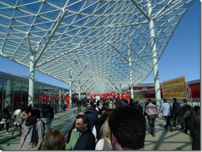
An early start on the second floor of the Fiera Salone. Already buyers, journalist , designers and more were herded though the entrances, carrying cameras and empty bags ready to fill with leaflets (the majority of which will probably just gather dust in an office the following week).
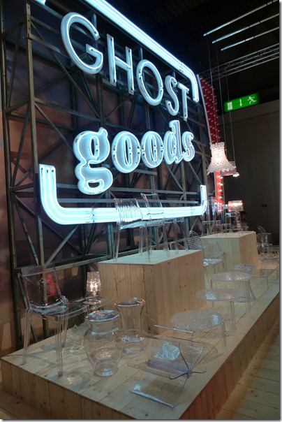
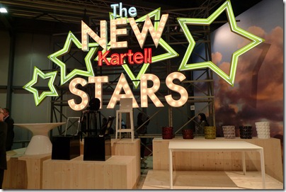
So Halls 20 & 16 first, with the large modern design brands & Kartell know how to make an impressive entrance display.
Their stand was huge, mainly consisting of their familiar translucent classics. There was also a sneaky preview with prototypes of products they hope to roll out in 2012
Missoni Home had a very different space this year, but as always it was filled with intricate patterns and fresh new season colours. I would never think of mixing this much pattern together, but it works.
From their Centosettanta collection I particularly like their simple Bubble Lamps.
Molentini&C had yet another massive stand. I really like this modular blocking shelving used as a divider; if only I had this much space!
One really prevalent trend this year was leather covered metal frames, from rod to box section. quite an industrial look with an element of luxury.
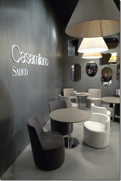
The mix of on trend tones and colours with vintage feeling materials was also about. Here on the German company Sahco’s stand, some of the materials were reminiscent of 50’s/60’s dresses or embossed anaglypta wallpaper.
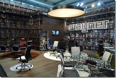
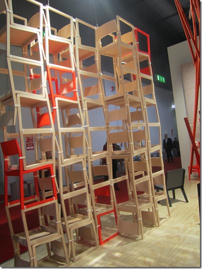
Allot of companies incorporated their product direct into the display and structure of their stands.
Italian company Alias, had so many amazing well considered designs were every details had been meticulously developed until the product was resolved.
The development of the Loggia bookshelf by Jakob Timpe, was shown in diddy display cases. Below you can see the range of connector shapes that were prototyped.
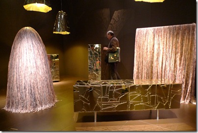
Some Grass Skirted wanders by the Campana Brothers.
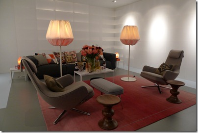
Vitra had a large multi room display crammed full of people eagerly craning their necks peering between each others heads to see.
Each roomset was carefully curated and exquisitely styled. All the products contrasted so much in colour and texture, but still came together under the Vitra style.
Above Grand Repos and Panchina Antonio Citterio.
Below HAL chair by Jasper Morrison.
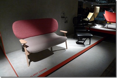
Easy Chairs were everywhere, think Pierson Lloyd PLC chair. The Wolfgang Chair by Luca Nichetto caught my eye. There are a family of chair within the range, where the curved wood back comes with and without upholstery.
Above a totally thankless task. They had even given up telling people not to take photos!
Big knits are still popular. Casalis is a company usually associated with just rug, but how cute are these creature-like bean bags?!
Patricia Urquiola is an amazingly talented designer with products on virtually very big name stand at the fair! Above is a sofa part of the Klara range for Moroso.
On the Moroso stand they had a wall of information pads, where visitors to tear off the product information they wanted, a great idea and easy on the increasingly heavy bags!
Below are just a selection of stand displays; some nicer than others.
Mattiazzi stand that launched products by Nitzan Cohen, Sam Hecht, Ronan & Erwan Bouroullec.
Pedrali had a large spacious stand, with a simple but effective stand. Sometimes the products are over shaddowed by hw they’re displayed.
Above was a ‘I wish i thought of that’ moment with the Game of Trust Coat Rack by yiannis ghikas .
Not every stand had carefully muted down design, some went fore garish!
Foundry are a brand I haven’t come across before , their philosophy is to design Classics of the Future. Some really nice pieces from lighting to accessories.
Another Patricia Urquiola design; the Nub Chair by Andreu World. According to the designer, the Nub collection is the result of sophisticated cabinet-making, update with great care in a contemporary manner
And Finally, at the end of the day and at the end of the Halls; the Salone Satellite.
I don’t know if it’s because I was exhausted by stand after stand; or whether the product blindness had set in, but I was pretty underwhelmed by this zone this year. The same set up as last year, with no exciting seating areas. This was the only area if the fair where the credit crunch was still evident.
Well, that's enough negativity, there were still a few gems.
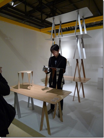
t/m Wafft Table by Japanese designer Takaaki Tani.
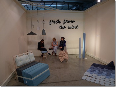
Fresh From The Mint consisting of six designers work. They tied their products together with the same colour pallet and design ethos. I also really loved their fabric logo on the back wall.
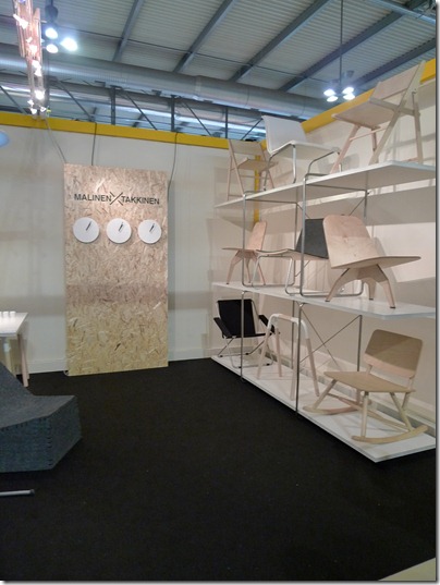
Malinen Takkinen a collaboration between two designers.
Like a moth to a flame I was drawn once again to the Studio Juju stand. last year they had a very different chair range called (Bambi and Platypus see Milano blog 2010), and this year they have illustrated, their design skill and style translates across to tableware and lighting too. I particularly liked their Wobble and Mushroom tableware range made from Maple and Aluminium.
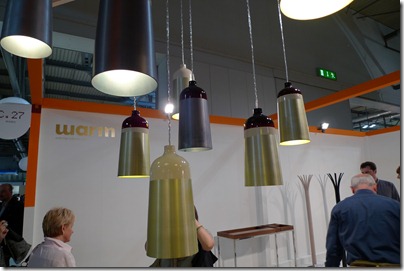
Warm, a brand by designer Corinna Warm, had a much larger stand this year and launched several new products. My favourite was the Glaze lamps (above) . the depth of colour was delicious, with the dipped colours calling out to be touched.
Jarrod Lim design, had a real mix of product, his Koi chair and Hi Ho rocker was exhibited last year and was taken on my Innermost, who exhibited it at Designjunction in 2011. the Interlock Coatstand was the most interesting for me this year.
Up the top of the viewing platform.
And down below!
Serpent modular shelving by Bashko Trybek.
Serpent Shelving system — appeared on the SaloneSatelite Award 2011 shortlist and later was placed among the 50 best SaloneSatellite 2011 projects on the yatzer.com design site.
FABRICA - Applied Arts and Communications Research Centre, this year exhibited under Here & (T)here. The brand is based on the combination of blown glass and oak in a search for dialogue between fragile and transparent glass and simple, solid wood. The result is a collection of hybrid sculptures centred on form that incorporate multiple functions.

Ciao for now.

















No comments:
Post a Comment