The London Design festival is always huge, and this is the first time since Purewhyte began that I am not exhibiting.
Which is brilliant as I actually get to see the festival, not just my 6 metre square stand, that could be anywhere on the planet! So I thought I’d take the opportunity to have a wander. Although I was a little jealous of all the exhibitors with their shiny new designs!
Here are the highlights; I've broken it down into 4 blogs of 25 images so you don’t get utterly overloaded. Enjoy, I did.

Tuesday: Modus Pecha Kucha night, this is the second one I have attended and it ranged from random images to 20 slides about vibrators. After were some drinks and great cheese!
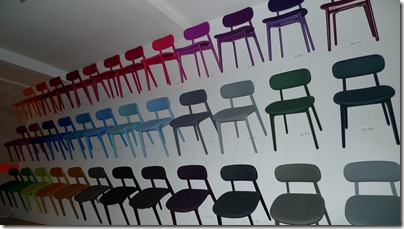
Below their Pick a Colour range: PLC chair by PearsonLloyd. They were then auctioned off at the end of the festival.

Wednesday : The Dock, which is also the home of the Tom Dixon, shop and head office. A great site, but a smaller show this year.


Thursday: 100% Design. in Earls Court 2 again this year, felt even smaller. A couple of nice bits though.
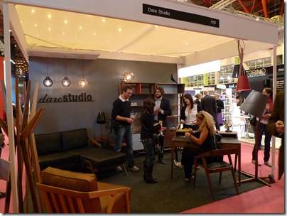
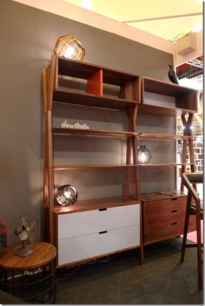
Here’s my friend Sean Dare of Dare Studio on his stand that he won part of his Hidden Art Award earlier on this year. With a couple of new products; I particularly like the Dixon Modular Storage, I love the retro use of colours and the fine craftsmanship.

The South Korean Design Pavilion is always well curated with no exception this year, plus they gave me a beautifully made bag (I’m easy to win over).

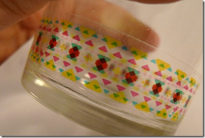
One of the designers Ji Hee Lee (zhee@601bisang.com) was a graphic designer who produced these glass tapes, I found them so intriguing. This is me trying out my gift at home…it will cover everything soon!

I had seen these Utter Mouth pots by Thelermont Hupton on loads if design blogs, they looked great as a collection of objects.

These hooks are a bit of fun on the Grimm++ stand, which is a collective of 6 designers. (info@grimmdesigners.com).
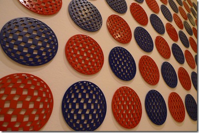
In 100% Futures Designed Made with a new Cubic Coaster range.

Here’s the new collection from Pottinger + Cole, who took a year out from exhibiting at 100% last year, the whole range is really strong, and I particularly like the Simple Side Table and Chaplin Lights; hopefully my year off will be as inspiring.

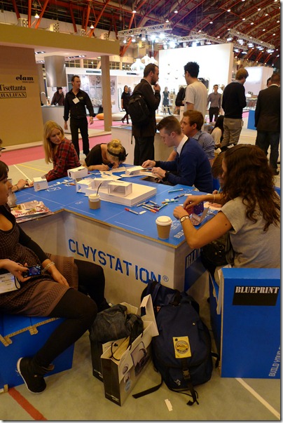
Here was one of the few interactive areas, that got visitors to use their creative side.
Here Blueprint Claystation are encouraging people to create individual rooms that when stapled together created a megga house block.
Spot the person who needs glasses!

I didn’t get time to have a go myself but, had a quick look as the interiors; this is my favourite, 10 out of 10 for commitment, that is allot of hand drawn books.


Some new products from James UK , I really like their Alywn Compact Sofa, great to see something UK design and produced.

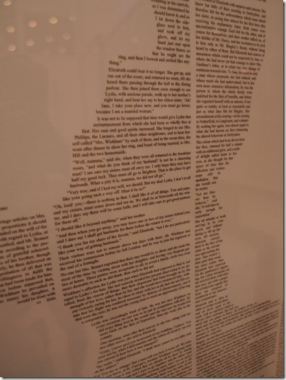
Just as I was leaving I spotted these Book Prints by Spineless Classics. All the designs are created by Carl Pappenheim and I think they’re great, simple and eye-catching .
Below you can see one of my favourites Pride and Prejudice, and if you look really closely you can read all the text.

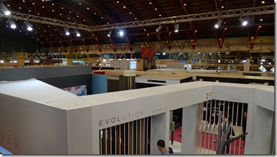
Done!
Instalment 2 coming soon.


No comments:
Post a Comment