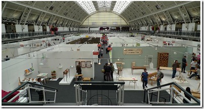
Every year a new crop of aspiring graduate designers make their way to the Business Design Centre in Angel, for New Designers.
Competing individually and across university’s, to catch the eye of a retailer or journalist.
I was lucky enough to visit both weeks 1 and 2 this year, so have included allot of 2d print and illustration for a change to my usual product heavy blog!

Below are a few peoples work that caught my eye as ‘ones to watch’.
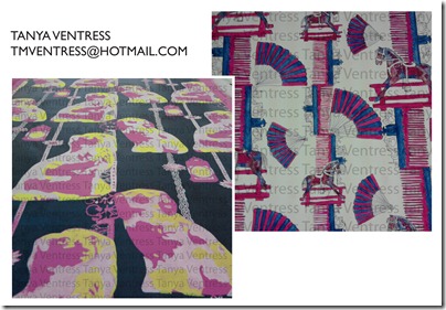
Tanya Ventress’ work had a great sense of fun, with traditional subjects printed in a contemporary way.
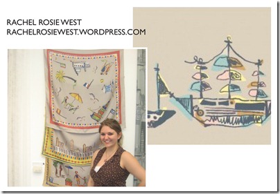
Rachel West’s illustrations had a vintage feel, and I really loved her quality of line and use of a selective colour pallet. Below are one of her scarves.


Lucy Porter’s surface pattern was really interesting as her base material was wood rather than fabric. The mix of pattern and animal silhouettes stood out among the surrounding work.

I’m really keen on this whole range created by Scott Coleman, each poster depicts a significant historical event on a particular year. The Channel Tunnel was 1990. The simple graphic style suits the poster format perfectly.

It was the naive quality of line that caught my eye with Rhi Pardoe’s illustration. I like how you can see where the pen has been; it’s not over polished and honest.

Simon Cooks work was my favourite from all of New Designers. Simon uses origami paper, collage and then digitally manipulates the image to create his work. He has already been commissioned for professional work (including Design week) and also has more commercial pattern based work.
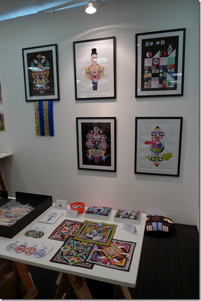

Sofi Fleming had a Good use of material, and construction of image pattern and colour.

Lucinda Ireland, has already been snapped up to do work professionally, and I’m sure her commercial style will be seen allot in the future. I like the simplicity and feminine style of the text.

Imogen Heath’s pattern has a simple vintage style with a modern look. Her work is really well executed and t should already be retailed.

Now for something 3D! I would buy one of Elin Green’s vessels straight away! One of the few people with innovative accessories, good use of material and colour.

This storage by Shu Aoki, was genius, such a simple block construction idea, but adding the modular stacking element gives it an edge.

I’ve seen James Melia’s work before and both his deck and desk lamp were really strong resolved designs. With all elements carefully considered and finished, right down to the subtle dip in the desk surface for coins, paper clips etc.

Suet Yi was part of the Decorative Arts stand (my old degree course) the small ‘bird’ vignette’s were enchanting. I don’t usually like things that don’t ‘do’ something, but these really caught my eye.

The Tune-tune musical stool by Jo-yun Wang , combined kinetic fun with simple lines.

Ornella Stocco’s designs (recently featured on Dezeen) use materials where you wouldn’t usually expect them.
In week 1, Decorative Arts from Nottingham Trent Uni were on the Mezzanine floor. The course has evolved quite a bit since I studied there, with even more materials and specialist options. Some lovely pieces.

Other visuals feasts for visitors were stands by Tigerprint and Absolute. The Tigerprint ‘Gifted’ competition is still open to submissions until July 30th. Designers (who graduated in 2010 and 2011) have been invited to design a card, a cracker and a decoration. These querky gift bags were kindly demonstrated by two members of the Tigerprint team!

That’s it for another year, lets see if any of my predictions are correct in the future!


